Section Branding
Header Content
Making Strides Against Childhood Obesity
Primary Content

Georgia ranks in the top five for fattest states in the nation. Our children are not an exception to this ranking. Dr. Mark L. Wulkan says the obesity epidemic in Georgia ranks it second in the nation. And unfortunately, most families don’t even realize their children are obese:
“It’s perfectly understandable when you have nearly 40% of the kids overweight, when you look to the right or left, your kid may not look that different than the other kids, but the problem is the whole population is overweight and at risk for diseases and health consequences.”
Agencies all around Georgia have been gearing up to fight childhood obesity with the common thought that healthier children will mean healthier adults. With less sick days and less expense on health issues related to obesity, healthy adults contribute to a healthy economy. That is something from which Georgia could definitely benefit.
In its second year, Camp Strong 4 Life is making strides in decreasing childhood obesity. As a part of Children’s Hospital of Atlanta (CHOA), the goal of Camp Strong 4 Life is “to help overweight children improve their lives by emphasizing increased physical activity, better eating habits and heightened motivation to engage in healthy behaviors.”
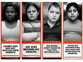
While the camp is achieving positive results in only its second year, CHOA’s Strong4Life campaign has not always gotten rave reviews. Its billboard campaign, which launched last May, received some pretty negative press for targeting children and worsening “fat stigma,” though the goal they were hoping for was to trigger awareness among parents and caregivers of the growing problem of childhood obesity.

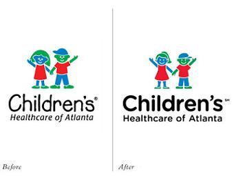
The organization is facing the front lines of caring for children with health issues related to obesity and no doubt have a clear picture of the issues that differs from what parents see when looking at their children. Camp Strong 4 Life is one way they are actively fighting to improve child health. Recently, CHOA also updated their logo, making the children in their logo thinner. To my non-marketing background eye, the differences are pretty slight. They seem to look older, less like toddlers, and more like 9- or 12-year-olds. I have been working long enough to go through logo changes with companies and I can tell you that is a big deal. It affects everything from emails and business cards to the big sign out front and how the community perceives the organization. So, to me, the logo change is more evidence of their effort to tackle childhood obesity.
Secondary Content
Bottom Content


