Section Branding
Header Content
Deconstructing Georgia's Dubious COVID-19 Data Dashboard
Primary Content
Georgia's COVID-19 data dashboard is an important tool to understand how the virus has spread, but several high-profile errors and choices about how information is presented has raised questions over its usefulness.
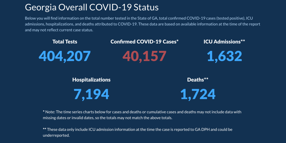
Most recently, the Georgia Department of Public Health acknowledged that not all of the 402,000 or so tests reported are the traditional diagnostic tests that determine if someone has coronavirus.
More than 10% of the "completed tests" are antibody tests, which are used to determine if someone once had the coronavirus. But having a positive antibody test is not counted in the state's overall positive case count, so the combination of the two testing sources artificially inflates test count and deflates the rate of positive cases per test completed.
In isolation, the decision to count both types of tests (which DPH says aligns with Centers for Disease Control and Prevention protocol) calls into question the methodology that state and local leaders are using to make policy decisions to ease restrictions and that members of the public use to go about their daily activities.
But the antibody testing fiasco is the latest revelation that the error-plagued public health website needs further scrutiny to understand the true effects of COVID-19.
Yesterday, a processing error inadvertently included 231 serologic test results among the positive #COVID19 cases. The error was corrected, but it caused a decrease in positive cases between reporting periods on our dashboard. We apologize for the error and the confusion.— GaDeptPublicHealth (@GaDPH) May 18, 2020
Over the weekend, DPH issued an apology for adding, then subracting, antibody tests into the confirmed case totals. One day, nearly 200,000 completed tests disappeared from the site, giving the brief appearance that Georgia had more people infected by the virus than tested for it.
For the last week and a half, national news outlets seized upon a lesser-known graph that purported to show the two-week trajectory of cases in the most impacted counties. One problem? None of the days were in chronological order, and the counties were not in a consistent location within each day's data point.
MORE: Georgia’s Gaffe-Prone COVID-19 Dashboard Is Useful – If You Know Where To Look
J.C. Bradbury, an economics professor at Kennesaw State University, said that Georgia's problem is that there is too much data shown and not enough context and explanation to help understand it.
“So there's a lot of bells and whistles there rather than focusing on being consistent and being clear," he said. "You know, the hard part is gathering the numbers, the easy part should be reporting them.”
Bradbury said that when looking at Georgia's data site, especially tracking the number of cases over time, it is easy for people to infer things that might not be correct, even with some footnotes on graphs.
On the "cases over time" graph, Georgia also assigns positive case data differently than the way most people track things. If someone first shows symptoms of the virus on May 14, but the test results come back May 21, many observers would count that positive case on May 21. But Georgia would assign it to May 14, meaning there is always going to be about two weeks of incomplete data while the state backfills things.
Couple that with a delay in the reporting of test results and you can easily get an incomplete picture of where and how the virus is moving through the state.
Even if Georgia's data dashboard had fewer easier-to-read graphs, it would still be too early to tell if Gov. Brian Kemp's reopening decision has led to an increase or decrease in cases.


