Section Branding
Header Content
Pantone's 2025 color is Mocha Mousse: How the company sold color to the world
Primary Content
Each year, since the turn of the millennium, word arrives from on high: Pantone, the self-described world's authority on color, announces its Color of the Year.
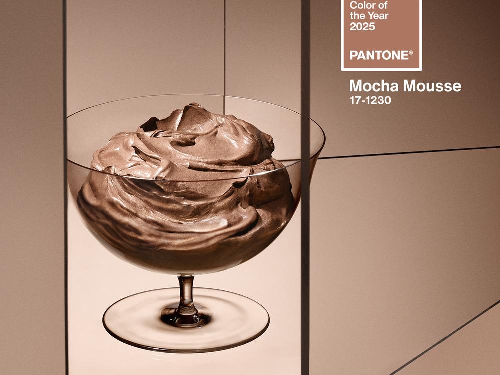
On Thursday, Pantone declared "Mocha Mousse" as the color for 2025.
The "evocative soft brown" or "warming rich brown hue," the company said in a press release, "nurtures with its suggestion of the delectable quality of cacao, chocolate and coffee, appealing to our desire for comfort."
In unveiling a hue meant to reflect the culture through the language of color, Pantone also forecasts what's next in design trends.
The earthy color seizes on "a growing movement to align ourselves with the natural world," the release read.
Pantone's Color of the Year is meant to capture the zeitgeist, said Laurie Pressman, vice president of the Pantone Color Institute. At the same time, it's also intended to serve as a cultural antidote.
"It's emblematic of a snapshot in time and it's giving people what they feel they need — that that color can hope to answer," Pressman said. "It's us taking the temperature: What's taking place in the world around us and how does that get expressed into the language of color?"
"And as we were doing our research for this year, what we were really seeing more than anything is people looking for harmony and living a life of harmony," she said, and a need to feel "grounded."
In response to the annual color pick, designers in fashion and interiors, marketers and creators incorporate the pigment into their products to stay on trend. As part of the campaign, brands partner with Pantone, making the company money from owning a color.
That said, you can expect to see a lot more brown around.
But Pantone is not the only company to develop a standardized set of colors, nor the first to put names to colors. So, what makes Pantone such a color expert?
From the start, Pantone recognized the need to portray color accurately. More importantly, it knew how to sell it.
How Pantone set the industry standard
Before it became the color juggernaut it is today, Pantone was a commercial printing company under a different name. When Lawrence Herbert, a print technician with a background in chemistry, was hired by the corporation in the 1950s, he identified a recurring problem in his work.
When requesting printed copies, of brochures or posters, customers struggled to talk about color accurately. To get the color they were after, as Herbert's son Richard, a former president of Pantone, told NPR's Planet Money earlier this year, they would have to send in an actual sample of the color.
"Our famous thing was — cut a piece off their tie and send it into the print and say, match this color," Richard said. "They had their own ink formula books, and they could get close. But it was very random."
In 1963, Lawrence founded the solution. He developed the Pantone Matching System (PMS) as a way to standardize color reproduction so that print copies matched the original, no matter the printing device. He got buy-in from ink makers for his color standard, first in the U.S. and later in Europe and Asia.
Pantone expanded its range of pigments, and by 1968 it became the industry standard.
Pressman credits the shrewd marketer in Herbert for turning Pantone into a widely accepted color system.
"He understood, if this is an issue going on in print, this is an issue that goes through many other different industries," Pressman said.
Clients across a range of industries would knock on Pantone's door to get help with getting their color uniform, often before Pantone had developed a way to do so. There was a need in the market for custom color development and Pantone adapted, according to the company's vice president.
As other industries, such as the fashion and home markets, turned to Pantone to get the right color match, the company branched out from paper into textiles and created new color formats that could translate to a variety of materials. Today, its library of colors numbers upwards of 10,000 different colors.
The Color of the Year campaign, aided by its public relations arm, became another opportunity for Pantone to sell its proprietary colors, through the formulation books and color palettes it sells, or brand deals and partnerships.
Some of its famous trademarked colors belong to big brands. Both Target's bold red and Tiffany & Co.'s robin egg blue belong to the Pantone color family.
Pantone's precursors are rooted in the need to describe the natural world
A color chosen to correspond to the natural world is fitting, considering the history of modern color systems.
Before Pantone turned its color standard into a big business, some of the first modern color systems came from naturalists trying to identify and differentiate bird species or flowers in reference works known as color dictionaries.
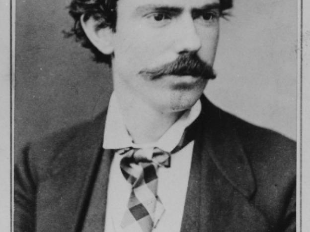
Color systems date back to at least the 17th century, but in the 19th century, an ornithologist named Robert Ridgway took issue with some of the existing nomenclature of colors, according to Daniel Lewis, who authored The Feathery Tribe, a biography of Ridgway.
In his 1912 self-published work, titled Color Standards and Color Nomenclature, an expansion of his first color book of 1886, Ridgway wrote that "the nomenclature of colors remains vague and, for practical purposes, meaningless, thereby seriously impeding progress in almost every branch of industry and research."
He decried the nondescriptive and befuddling names of popular colors, wrote Lewis, including "baby blue," "London smoke," "ashes of roses" and "elephant's breath."
Ridgway's color dictionary, with over 1,000 colors, included hues that referenced birds, like "Jay Blue," while others derived from fruits — "Apple Green" — or the natural environment, as in "Storm Gray."
His color book "evolved into the Pantone color chart," according to Lewis. "Ridgway's Colors" are still used today by mycologists, philatelists and food colorists, according to Lewis' 2012 book.
But his color mixing system was technically flawed, subject to the whims of the natural elements, and never became widely adopted.
An article in Hyperallergic, an online arts magazine, from 2016 cites a 1985 critique published by the Beta Beta Beta Biological Society: "Color Standards lacks precise descriptions of how to reproduce the colors. In addition to this problem, Ridgway chose some pigments that were not as permanent as he had hoped, but were affected by humidity, abrasion, and hue shift."
Another edge Pantone has on its competitors is that it knows how to tell stories about color and arrange them in an accessible way.
"You can't copyright a word. But when you organize words in a specific way, it tells a story and a unique story. The same is true with color. You can't copyright a color. But, you know, if you create this arrangement of colors that creates a system, that's protectable, and that's copyrightable."
Because its color system is protected, graphic designers, dye manufacturers and others working in the world of color have been stymied. In 2022, for example, when Pantone's deal with Adobe ended, a paywall went up for the Pantone colors in Photoshop; if you weren't willing to pay a monthly fee, the colors turned black.
Still, according to Pantone, plenty of other people are willing to pay.
"You have more and more people — as we live in this visual culture — wanting guidance," Pressman said. "So much money rests on these decisions."


